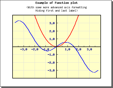
Figure 1: Example of both how to adjust the position of the X-axis as well as adjusting the side for the tick and axis title [src]
In addition to the standard positioning you may also use the two special position markers "min" and "max". This will position the axis at the minimum (or maximum) position of the other axis.
For example, to make sure that the X-axis is always at the bottom of the graph (at lowest possible Y-value) you would have to add the line
$graph->xaxis->SetPos("min");
To change the color and width of the axis you have to make use of the Axis::SetColor() and Axis::SetWeight() methods.
You might also want to add titles to the axis. This is done through the Axis::SetTitle() method. This is actually just a shortcut for accessing the title property direct. Axis::title::Set() which also allow you to set the alignment in one call.
By default the position of the title is to the far right for the X-axis and in the middle (and 90 degrees rotated) for the Y-axis.
You can adjust the position of the title with the help of the second argument to the Axis::SetTitle() method.
The possible positions are "high","middle" and "low" which refers to the scale values on the axis.
One common modification you might want to do to the title is to increase the margin between the axis and the actual title. This is often necessary to do for the Y-axis if the values displayed are large. You may adjust the distance (in pixels) between the axis and the title by using the method Axis::SetTitleMargin()
So for example to increase the margin on the Y-axis you might add the line
$graph->yaxis->SetTitleMargin(40);
to your code.
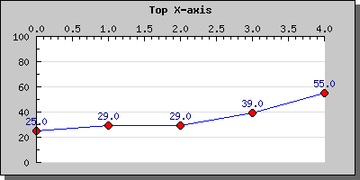
Finally we mention something about the positioning of tick marks and labels on the axis. You have the possibility to choose what side of the axis the tick marks and the labels should be at. For the X-axis this can be specified as either on the the top (inside the plot area) or at bottom (outside of the plotarea). In the same way you can specify for the Y-axis if the labels ( or ticks) should be on the left or right side.
To adjust the label positioning you have to use the method Axis::SetTitleSide() and to adjust the position of the tick mark you have to use the method SetTickSide()
 $graph->xaxis->SetLabelPos(SIDE_UP);

$graph->xaxis->SetTickSide(SIDE_DOWN);
This technique is for example used if you position the X-axis at the top of the graph as the following example shows.
Before we continue we show a small example to illustrate this feature
The example above shows the basic configuration. There are now several modifications you may do to these axis like
to adjust the actual label format (like font, color, angle) you need to access the Axis::SetFont() and the Axis::SetColor() methods. If you investigate the Axis class you will discover more methods to adjust the many aspects of the axis layout.
As a final note we also mention the methods Axis::SetLabelAlign() and Axis::SetLabelAngle() This first method is really only mentioned here for completeness since it is mostly used for internal purposes. However on some occasion you might want to adjust the alignment of the labels. By default they are centered in respect to the tick mark. By using the method you might override this positioning should you choose to do so.
The second of these methods adjusts the angle of the label in regards to the axis. This is very useful for X-axis that have long labels.
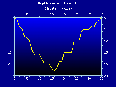
An inverted Y-scale has the lowest number at the top and the scale values increases downwards.
Even though JpGraph doesn't directly support this feature it is quite easy to achieve with just a few extra lines of code in your image script.
Before we continue we give an example of what we are referring to.
Two achieve this effect there are two simple steps to take:
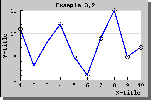
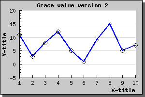
However you might sometime want to add some extra to the minimum and maximum values so that there is some "air" in the graph between the end of the scale values and the extreme points in the graphs. This can be done by adding a "grace" percentage to the scale. So for example adding 10% to the y-scale in the image above is done by calling the SetGrace() method on the yscale as in
$graph->yaxis->scale->SetGrace(10,10);
These lines add a minimum of 10% to the top and bottom values of the scale. Note that we say "minimum" since depending on the specific tick values choose this might be a little bit more to make the end of the scale fall on an even tick mark.
Adding this line to the previous graph will result in the following example
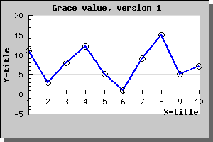
Since we haven't adjusted the positoin of the X-axis it will remain at Y=0 which might not necessary be waht we would like so we therefor also add the line
$graph->xaxis->SetPos("min");
So that the X-axis always will remain at the lowest possible Y-value. Doing this will then result in the example below