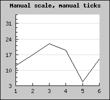
To specify a manual scale you have to add arguments to the standard Graph::SetScale() method.
So to specify that you want an Y-scale between 0 and 100 you need to
write
$graph->SetScale("textlin",0,100);
When you specify a scale manually there is one additional thing you need to decide. How the tick marks should be positioned. You have three choices
 $graph->SetScale("textlin",0,100);

$graph->yscale->ticks->Set(10,5);
Will set the major tick marks every at 0,10,20,.. And every minor tick mark in between (0,5,10,15,20,25,...).
In the following we will assume that all data points are specified by a tuple where the date/time is specified as a timestamp in second in the same format as is returned by the PHP function time().
The trick here is to use a label formatting callback routine which gets called to format each label on the scale.
What we do is that we specify that the X-scale should be an ordinary "int" scale (remember that the data values are timestamps which are integers). We then install our custom label callback (with a call to SetLabelFormatCallback()) which given a timestamp formats it to a suitable human readable form. In our example we will use the PHP function Date() for this purpose.
The callback we use will be
 // The callback that converts timestamp
 to minutes and seconds

function TimeCallback($aVal) {

    return Date('H:i:s',$aVal);

}
Using some random data we can now generate the following graph
In the above example we have specified the X-scale manually to make sure that the min/max values on the X-axis exactly matches the min/max x-data values.
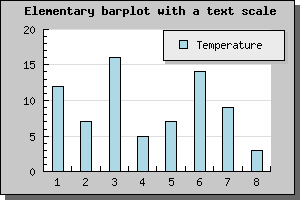
As a remainder; Text scale is meant to be used on the X-axis when the X-axis doesn't have a numeric value, i.e you are only interested in linear ordering of the data. If you don't specify the labels manually they will be set automatically starting from 1 as the example below shows.
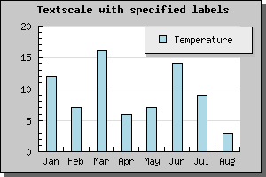
To specify the labels on the X-axis as suitable text strings you call the method Axis::SetTickLabels() with an array containing the text-labels. If there are more data points than labels the non-specified labels will be given their ordinal number. If we augment the previous example with the name of the month we get the following new example
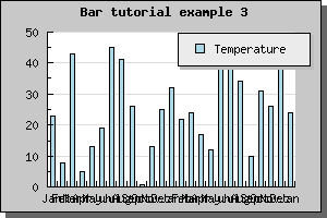
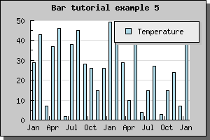
What happen now if we have a larger number of bars? Let's try with 25 bars and see what result we get.
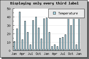
Not all to impressive. The labels are to close and they overlap. Hence it is not a good idea to display every label. To adjust what labels are to be displayed you use the SetTextLabelInterval() method. The argument to this method is the interval between text labels. So to display only every 3 month you would add the line
$graph->xaxis->SetTextLabelIntervall(3)
Which would give the result shown below
Much better, quite readable.
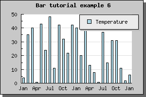
If we have an even larger data set it might not longer be meaningful to display all the tick marks since they would simple become to close. In JpGraph there is a possibility to specify that you only would like every n:th tick mark to be visible ( SetTextTickIntervall() ). For bar graphs using text scale however, that might not be such a good idea since the tick marks are between the bars and the labels centered under the bars. If we only were to display, say, every 3 tick mark it wouldn't look to good. Not that we can't do it, as the example below shows, but it just doesn't look very good.
A better way to handle large data set is simply to hide the tick marks all together. Tick marks may be hidden by calling the method Axis::HideTicks(); If we hide all the ticks on the X-axis we will get the result shown below
More ... [ TBC ]