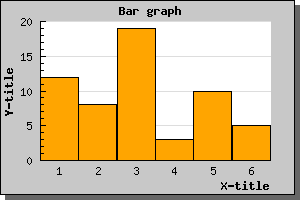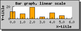
Figure 1: A small example with a bar graph using a linear X-scale [src]
Using bar plots is quite straightforward and works in much the same
way as line plots which you are already familiar with from the previous
examples. Assuming you have a data array consisting of the values
[12,8,19,3,10,5] and you want to display them as a bar plot. This is
the simplest way to do this:
 $datay=array(12,8,19,3,10,5);

$bplot = new BarPlot($datay);

$graph->Add($bplot);
If you comapre this to the previous line examples you can see that the only change necessary was that instead of createing a new line plot (via the new LinePlot(...) call) we used the statement new BarPplot().
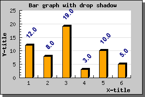
The other change we should do is to make sure the X-axis have an text-scale (it is perfectly fine to use a linear X-scale but in most cases this is not the effect you want when you use a bar graph, see more below). With this two simple change we will now get a bar graph as displayed in the following image You can of course modify the apperance of the bar graph. So for example to change the fill color you would use the BarPlot::SetFillColor() method. MAking this small change to the previous example would give the expected effect as can be seen in the next example. Sidebar: You should note from the previous two graphs that slight change in apperance for the X-scale. The bar graphs gets automatically centered between the tick marks when using as text x-scale. If you were to use a linear scale they would instead start at the left edge of the X-axis and the X-axis would be labeled with a linear scale. As is illustrated in the (small) example below
To set the width in fraction you use the method SetWidth() and to set the width in pixels you use the SetAbsWidth()
As an example let's take the previous example and set the width to 100% of the distance between the ticks. The example will now become
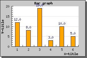
$barplot->value->Show();
Will enable the values in it's simplest form and will give the result
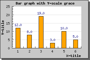
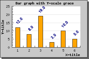
You cane see a small nuiance in this graph. The autoscaling
algorithm chooses quite tight limits for the scale so that the bars
just fit. Adding the value on top of the bar makes it collide with the
top of the graph. To remedy this we tell the autoscaling algorithm to
allow for more "grace" space at the top of the scale by using the
method
SetGrace() which is used to tell the scale to add a percentage (of
the total scale span) more space to either one end or both ends of the
scale. In this case we add 20% more space at the top to make more room
for the values with the line
$graph->yaxis->scale->SetGrace(20);
This will then give the graph as shown below
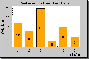
You can also adjust the general position of the value in respect to the bar by using the BarPlot::SetValuePos() method. You can set the position to either 'top' (the default) , 'center' or 'bottom'. The graph below shows the value being positioned in the center. In this example we have also adjusted the format to just display the value as an integer without any decimals.
It is also possible to specify a more fine grained control on how you want the values presented. You can for example, rotate them, change font, change color. It is also possible to adjust the actual value displayed by either using a printf()-type format string or with the more advanced technique of a format callback routine.
To show what you can do we just give another example for you to examine without much further explanations. Just remember that to have text at an angle other than 0 or 90 degrees we have to use TTF fonts. Even though we haven't explained the SetFont() method it should be fairly obvious.
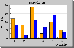
 // Create the bar plots

$b1plot = new BarPlot($data1y);

$b1plot->SetFillColor("orange");


$b2plot = new BarPlot($data2y);

$b2plot->SetFillColor("blue");


// Create the grouped bar plot

$gbplot = new GroupBarPlot(array($b1plot,$b2plot));


// ...and add it to the graPH

$graph->Add($gbplot);
The following example illustrates this type of graph
There is no limit on the number of plots you may group together.
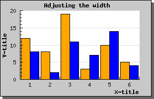
If you use the SetWidth() method on the GroupBarPlot() this will affect the total width used by all the added plots. Each individual bar width will be the same for all added bars. The default width for grouped bar is 70%.
Setting the grouped with to 0.9 would result in the image below.
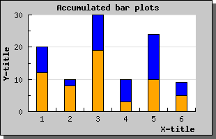
You create accumulated bar plots in the same way as grouped bar plots by first creating a number of ordinary bar plots that are then aggregated with a call to AccBarPlot();
An example makes this clear. Let's use the same data as in the two examples above but instead of grouping the bars we accumulate (or stack) them. The code would be very similar (actually only one line has to change)
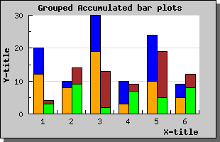
 // Create all the 4 bar plots

$b1plot = new BarPlot($data1y);

$b1plot->SetFillColor("orange");

$b2plot = new BarPlot($data2y);

$b2plot->SetFillColor("blue");

$b3plot = new BarPlot($data3y);

$b3plot->SetFillColor("green");

$b4plot = new BarPlot($data4y);

$b4plot->SetFillColor("brown");


// Create the accumulated bar plots

$ab1plot = new AccBarPlot(array($b1plot,$b2plot));

$ab2plot = new AccBarPlot(array($b3plot,$b4plot));


// Create the grouped bar plot

$gbplot = new GroupBarPlot(array($ab1plot,$ab2plot));


// ...and add it to the graph

$graph->Add($gbplot);
Putting this together in an example would then produce the graph as whown below
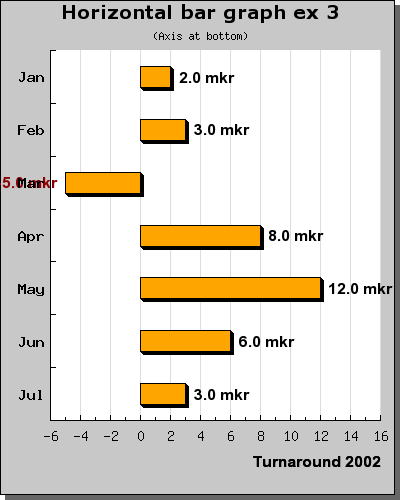
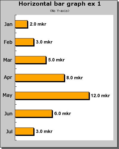
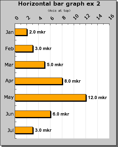
The example below shows a simple example of this
In order to achieve this effect you should study the above example carefully and you might notice two things
 // Since we swap width for height (since
 we rotate it 90 degrees)

// we have to adjust the margin to take into account for that

$top = 50;

$bottom = 30;

$left = 50;

$right = 20;

$adj = ($height-$width)/2;

$graph->SetMargin($top-$adj,$bottom-$adj,$right+$adj,$left+$adj);
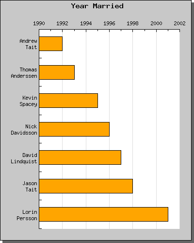
In the final example which is almost similair to the two first we illustrate the use of labels with more than one line.
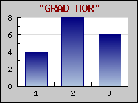
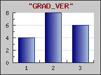
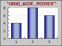
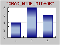
Color gradient fill fills a rectangle with a smooth transition between two colors. In what direction the transition goes (from left to right, down and up, fomr the middle and out etc) is determined by the style of the gradient fill. JpGraph currently supports 7 different styles. All supported styles are displayed in the figure below.
When using gadient fills there are a couple of caveats you should be aware of:
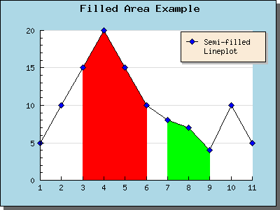
I this example we defined two areas along the X-axis to be filled. You can add filled areas by using the method AddArea() and specifying range and color for the filled area.