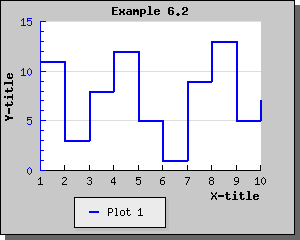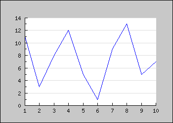
Figure 1: A simple line graph [src]
 <?php

include (
"../jpgraph.php");

include ("../jpgraph_line.php");


// Some data

$ydata =
 array(11,3,
8,12,5
,1,9,
13,5,7
);


// Create the graph. These two calls
 are always required

$graph =
 new Graph(350,
250,"auto");

$graph->SetScale(
"textlin");


// Create the linear plot

$lineplot
=new LinePlot($ydata);

$lineplot
->SetColor("blue");


// Add the plot to the graph

$graph->Add(
$lineplot);


// Display the graph

$graph->Stroke();

?>
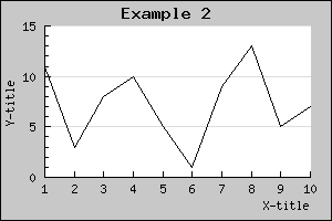
You might note a few things
For example the title of the graph is accessed through the 'Graph::title' property. So to specify a title string you make a call to the 'Set()' method on the title property as in:
$graph->title->Set('Example 2');
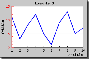
So by adding just a few more lines to the previous code we get a graph as shown below.
To achieve this we just needed to add a few more lines. (We only show
the part of example 1 we changed, to looka t the full source just click
the [src] link in the caption. )
 // Setup margin and titles

$graph->img->SetMargin(40,20,20,40);

$graph->title->Set("Example 2");

$graph->xaxis->title->Set("X-title");

$graph->yaxis->title->Set("Y-title");
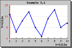
Again there are a couple of things you should note here
A nice change would now be to have all the titles in a bold font and
the line plot a little bit thicker and in blue color. Let's do that by
adding the lines
 $graph->title->SetFont(FF_FONT1,FS_BOLD);

$graph->yaxis->title->SetFont(FF_FONT1,FS_BOLD);

$graph->xaxis->title->SetFont(FF_FONT1,FS_BOLD);

$lineplot->SetColor("blue");

$lineplot->SetWeight(2);  // Two pixel wide
Again please note the consistent interface. To change font you just
have to invoke the SetFont() method on the appropriate object. This
principle is true for most methods you will learn. The methods may be
applied to a variety of objects in JpGraph. So for example it might not
come as a big surprise that to have the Y-axis in red you have to say:
$graph->yaxis->SetColor("red")
or perhaps we also want to make the Y-axis a bit wider by
$graph->yaxis->SetWidth(2)
As a final touch let's add a frame and a drop shadow around the
image since this is by default turned off. This is done with
$graph->SetShadow()The result of all these modifications are shown below.
For now let's just add a triangle shape marker to our previous graph
by adding the line
$lineplot->mark->SetType(MARK_UTRIANGLE);Thiw will give the graph as shown below
If you like you can ofd course both change the size, fill-color and frame color of the choosen plot mark.
The colors of the marks will, if you don't specify them explicitly, follow the line color. Please note that if you want different colors for the marks and the line the call to SetColor() for the marks must be done after the call to the line since the marks color will always be reset to the lines color when you set the line.
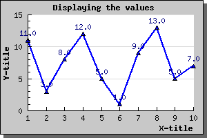
To enable the display of the value you just need to call the Show()
method of the value as in
$lineplot->value->Show()
Adding that line to the previous line plot would give the result shown below.
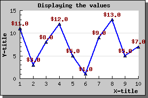
We can of course change both color, font and format of the displyed
value. So for example if we wanted the display values to be dark red,
use a bold font and have a '$' in front we need to add the lines
 $lineplot->value->SetColor("darkred");

$lineplot->value->SetFont(FF_FONT1,FS_BOLD);

$lineplot->value->SetFormat("$ %0.1f");
This would then result in the following image
The following lines show how to create the new plot and add it to
the graph (we only show the new lines - not the full script)
$ydata2 =
array(1,19,15,7,22,14,5,9,21,13);
$lineplot2=new LinePlot($ydata2);
$lineplot2->SetColor("orange");
$lineplot2->SetWeight(2);
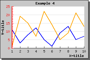
$graph->Add($lineplot2);Making these changes to the previous graph script would generate a new graph as illustrated below.
There is a few things worth noting here
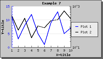
The solution to this is to use a second Y-axis with a different scale and add the second plot to this Y-axis instead. Let's take a look at how that is accomplished.
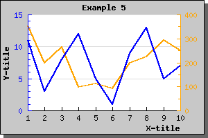
First we need to create a new data array with large values and
secondly we need to specify a scale for the Y2 axis. This is done by
the lines
 $y2data =
 array(354,200,265,99,111,91,198,225,293,251);

$graph->SetY2Scale("lin");
and finally we create a new line plot and add that to the second Y-axis. Note that we here use a new method, AddY2(), since we want this plot to be added to the second Y-axis. Note that JpGraph will only support two different Y-axis. This is not considered a limitation since using more than two scales in the same graph would make it very difficult to interpret the meaning of the graph.
To make the graph a little bit more aesthetical pleasing we use different colors for the different plots and let the two different Y-axis get the same colors as the plots.
The resulting graph is shown below. source)
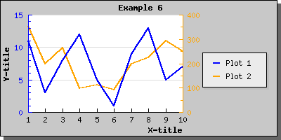
You will see that each plot type has a 'SetLegend()' method which is
used to name that plot in the legend. SO to name the two plots in the
example we have been working with so far we need to add the lines
 $lineplot->SetLegend("Plot 1");

$lineplot2->SetLegend("Plot 2");
to the previous code. The resulting graph is shown below As you can see the legend gets automatically sized depending on how many plots there are that have legend texts to display. By default it is placed with it's top right corner close to the upper right edge of the image. Depending on the image you might want to adjust this or you might want to add a larger margin which is big enough to accompany the legend. Let's do both.
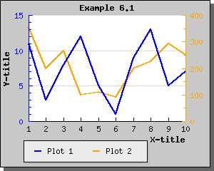
First we increase the right margin and then we place the legend so that it is roughly centred. We will also enlarge the overall image so the plot area doesn't get too squeezed.
To modify the legend you access the 'legend' property of the graph. For a full reference on all the possibilities (changing colors, layout, etc) see class legend in the class reference
For this we use the legends 'SetPos()' method as in
$graph->legend->Pos(0.05,0.5,"right","center");Doing this small modification will give the result shown below
The above method 'SetPos()' deserves some explanation since it might not be obvious. You specify the position as a fraction of the overall width and height of the entire image. This makes it possible for you to resize the image within disturbing the relative position of the legend. We will later see that the same method is just to place arbitrary text in the image.
To give added flexibility one must also specify to what edge of the legend the position given should be relative to. In the example above we have specified "right" edge on the legend for the for the horizontal positioning and "center" for the vertical position.
This means that the right edge of the legend should be position 5 % of the image width from the right. If you had specified "left" the the legends left edge would be positioned 5 % of hte image width from the image left side.
By default the legends in the legend box gets stacked on top of each other. The other possibility is to have them sideways. To adjust this you use the SetLayout() method. Using a horizontal layout with the previous example give the following result.
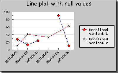
If the data value is null ("") or the special value "x" then the data point will not be plotted and will leave a gap in the line.
If the data value is "-" then the line will be drawn between the previous and next point in the data ignoring the "-" point.
The following example shows both these posibilities.
You specify that you want the plot to ber rendered with this style by calling the method SetStepStyle() on the lineplot.
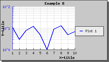
include("jpgraph_log.php");
on the top of your code. To Illustrate how to use a logarithmic
scale let's make the right Y scale in the previous example a
logarithmic scale. This is done by the line
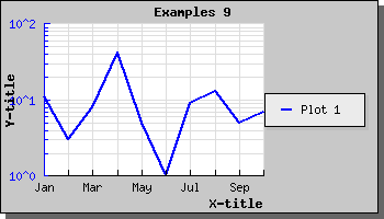
$graph->SetY2Scale("log");
This will then give the following result
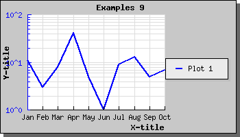
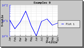
You can of course also use a logarithmic X-scale as well. The following example shows this.
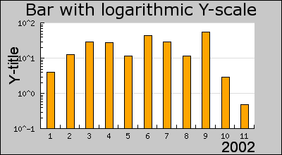
Even though we have so far only shown line graphs logarithmic scale can also be used for bar, error, scatter plots as well. Even radar plots supports the use of logarithmic plots. The following example shows how to use a logarithmic scale for a bar graph.
The normal practice for text scale is to specify text strings as labels instead as the default natural numbers. You can specify text strings for the labels by calling the SetTickLabels() method on the Axis.
To specify the scale you use the SetScale() method. A few examples might help clarify this.
To specify the scale for the Y2 axis you use the SetY2Scale() Since you only specify one axis you only specify "half" of the string in the previous examples. So to set a logarithmic Y2 scale you will call SetY2Scale("log");'; ShowCodeSnippet($t); ?>
The grid is modified by accessing the xgrid (or ygrid) component of
the graph. So to disply minor grid lines for the Y graph we make the
call
$graph->ygrid->Show(true,true)
The first parameter determines if the grid should be displayed at all and the second parameter determines whether or not the minor grid lines should be displayed.
If you also wanted the gridlines to be displayed for the Y2 axis you
would call
$graph->y2grid->Show(true,true)
Note. In general it is not a good idea to display both the Y and Y2 gridlines since the resulting image becomes difficult to read for a viewer.
We can also enable the X-gridlines with the call
$graph->xgrid->Show(true)
In the above line we will of course only just enable the major grid lines.
To bring all this together we will display a graph with gridlines for both Y and X axis enabled.
Note: If you think the first value of the Y-axis is to close to the first label of the X-axis you have the option of either increasing the margin (with a call to SetLabelMargin() ) or to hide the first label (with a call to HideFirstTickLabel() )
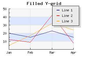
In the example above we have also made use of alphablending (requires GD 2.x or higher). By default the filled grid lines are disabled. To enable this style you have to call the Grid::SetFill() method.
To specify the labels on the scale you make use of the SetTickLabels() method.
To get a localized version of the name of the month you can use a nice feature in JpGraph, the global '$gDateLocal' object which is an instance of the DateLocale
This class has a number of methods to get localized versions of relevant names for dates, (months and weekdays).
So to specify the X-axis with the short form of the month names we
use the construction
 $a = $gDateLocale->GetShortMonth();

$graph->xaxis->SetTickLabels($a);
This will, now result in the image displayed below
Note: It is also perfectly legal to override the default labels for the Y (and Y2) axis in the same way, however there is seldom need for that. Please note that the supplied labels will be applied to each major tick label. If there are insufficient number of supplied labels the non-existent positions will have empty labels.
Specifying that we only want, for example, to print every second label on the axis is done by a call to the method SetTextLabelInterval() Which would result in the graph
If the text labels are long (for example full dates) then another way might bne to adjust the angle of the text. We could for example choose to rotate the labels on the X-axis by 90 degrees. With the help of the SetLabelAngle()
Which would then result in the image below
Note: The internal fonts which we have been using so only supports 0 or 90 degrees rotation. To use arbitrary angles you must specify TTF fonts. More on fonts later.
In the example below we have also, as an example, specified plot marks (see previous sections).
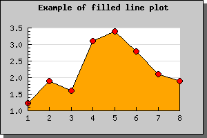
Note 1. If you add multiple filled line plots to one graph make sure you add the one with the highest Y-values first since it will otherwise overwrite the other plots and they will not be visible. Plots are stroked in the order they are added to the graph, so the graph you want front-most must be added last.
Note 2. When using legends with filled line plot the legend will show the fill color and not the bounding line color.
Note 3. Filled line plots is only supposed to be used with positive values. Filling line plots which have negative data values will probably not have the apperance you expect.
As you can see from the graph above the gridlines are below the filled line graph. If you want the gridlines in front of the graph you can adjust the depth with call to Graph::SetGridDepth() As the following example shows
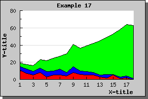
You may add any number of ordinary line graphs together. If you want to use three line plots in an accumulated line plot graph you write the following code
 // First create the individual plots

$p1 = new LinePlot($datay_1);

$p2 = new LinePlot($datay_2);

$p3 = new LinePlot($datay_3);


// Then add them together to form a accumulated plot

$ap = new AccLinePlot(array($p1,$p2,$p3));


// Add the accumulated line plot to the graph

$graph->Add($ap);
You might of course also fill each line plot by adding the lines
 $p1->SetFillColor("red");

$p2->SetFillColor("blue");

$p3->SetFillColor("green");
Using some appropriate data this might then give a graph perhaps like the one showed in the figure below
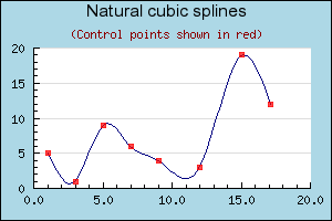
To construct a spline you need both the X and Y coordinates for the known data points.
You start by constructing a new Spline instance. To
get access to the Spline class you must first remember to include the
file "jpgraph_regstat.php". You instantiate this class by calling it
with your two known data arrays (X and Y) as follows.
$spline = new Spline($xdata,$ydata);
This call initilaizes the spline with the data points you have. These datapoints are also known as Cotrol points for the spline. This helper class doesn't draw any line itself. Instead it is mearly used to get a new (larger) data array which have all the interpolated values. You then use these new value in your plot. This way give you great flexibility in how you want to use this interpolated data.
Continuing the above line we now use the Spline::Get()
method to get an interpolated array containing a specified number of
points. So for example the line
 list($sdatax,$sdatay) =
 $spline->Get(50);
Will construct the two new data arrays '$sdatax' and '$sdatay' which contains 50 data points. These two arrays are constructed from the control poin we specified when we created the '$spline' object.
You would then use these two new data array in exactly the same way as you would form ordinary dat vectors.
The following example illustrates this
Note: In order to make the example more interesting we actually use two plots. First a line plot to get the smooth curve and then a standard scatter plot which is used to illustrate where the control points are.
$lineplot->mark->SetColor("red");
To choose between the different plot marks you call the PlotMark::SetType() method with the correct define to choose the plot type you want to use.
The simple shape type of plot marks are
$lineplot->mark->SetTYPE(MARK_IMG,"myimage.jpg",1.5);If you want to use one of the built-in images the following images are available. Please note that not all images are available in all possible colors. The available colors for each image is listed below.
The following shape (the first class) plot marks are available
For the second class (built-in images) the following table list the different images as well as what color they are available in. For the built-in images you specify the color with the second argument.
Note that some of the images are available in different sizes. The reason is that even though you can scale them by the third argument there is a visual degradation to scale an image larger than it's original size since some pixels needs to be interpolated. Reducing the size with a scale < 1.0 gives much better visual apperance.
The scaling works with both GD 1 and GD 2 but with GD 2 the quality of the scaling is much better.
Built-in images and available colors:
| Type | Description | Colors |
|---|---|---|
| MARK_IMG_PUSHPIN, MARK_IMG_SPUSHPIN | Push-pin image | 'red','blue','green','pink','orange' |
| MARK_IMG_LPUSHPIN | A larger Push-pin image | 'red','blue','green','pink','orange' |
| MARK_IMG_BALL, MARK_IMAGE_SBALL | A round 3D rendered ball | 'bluegreen','cyan','darkgray','greengray', 'gray','graypurple','green','greenblue','lightblue', 'lightred','navy','orange','purple','red','yellow' |
| MARK_IMAGE_MBALL | A medium sized round 3D rendered ball | 'blue','bluegreen','brown','cyan', 'darkgray','greengray','gray','green', 'greenblue','lightblue','lightred', 'purple','red','white','yellow' |
| MARK_IMAGE_LBALL | A large sized round 3D rendered ball | 'blue','lightblue','brown','darkgreen', 'green','purple','red','gray','yellow','silver','gray' |
| MARK_IMAGE_SQUARE | A 3D rendered square | 'bluegreen','blue','green', 'lightblue','orange','purple','red','yellow' |
| MARK_IMG_STAR | A 3D rendered star image | 'bluegreen','lightblue','purple','blue','green','pink','red','yellow' |
| MARK_IMG_DIAMOND | A 3D rendered diamond | 'lightblue','darkblue','gray', 'blue','pink','purple','red','yellow' |
| MARK_IMG_BEVEL | A 3D rendered bevel style round ring | 'green','purple','orange','red','yellow' |