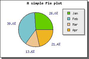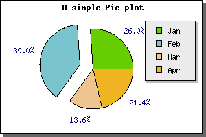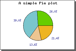
Figure 1: The simplest possible pie graph [src]
The main difference as compared to the X-Y plots is that to all pie plots are added to the PieGraph() instead of the Graph() object we used for the X-Y graphs we have drawn so far. For this you must first include the "jpgraph_pie.php" in your script (or "jpgraph_pie3d.php" if you want to use 3-dimensional pies).
Below you cane see the code needed to create the simplest possible pie graph just using the default settings.
 include ("../jpgraph.php");

include ("../jpgraph_pie.php");


$data = array(40,60,21,33);


$graph = new PieGraph(300,200);

$graph->SetShadow();


$graph->title->Set("A simple Pie plot");


$p1 = new PiePlot($data);

$graph->Add($p1);

$graph->Stroke();
The above code would give the following pie graph
There is a few things worth noting here
The next simplest addition we can do is to add a legend to the pie graph. We do this by using the SetLegends(); method. By adding the legends to the previous example we get the following image
(In the figure above we also moved the center of the pie slightly to the left to make more room for the legend box.)
The text for the legends can also contain printf() style format strings to format a number. This number passed on into this string is either the absolute value of the slice or the percentage value. How to switch between the is describe further down in this chapter.
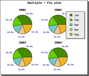
The next change you might want to change is the size and position of the Pie plot. You can change the size with a call to SetSize(); and the position of the center of the pie plot with a call to SetCenter(); The size can be specified as either an absolute size in pixels or as a fraction of width/height (whatever is the smallest). The position of the pie plot is specified as a fraction of the width and height.
To put the size and positioning API to use we will show how to put several pie plots on the same pie graph. In the following example we have also adjusted the legends of the slice values to use a smaller font.
What we do in this example is quite simple, create 4 pie plots, make them smaller and put them in the four corner of the graph. This will give the result as shown in the following example.
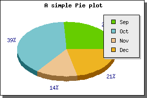
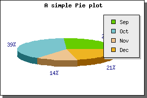
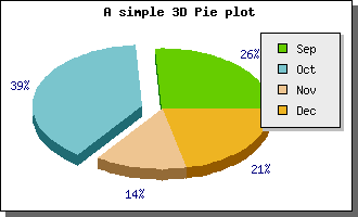
3D Pie plots have the same possibilities as the normal pie plots with the added twist of a 3:rd dimension. You can adjust the perspective angle with the method SetAngle() So for example to make the pie more "flat" you just set it to a smaller angle. Setting the perspective angle to 20 degrees in the previous example will give the following result.
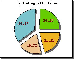
Exploding slices is accomplished by the methods Explode() and ExplodeSlice() The first method is used if you want to explode more than one slices and the second is a shorthand to make it easy to just explode one slice.
For example to explode one slice the default "explode" radius you
would just have to say
$pieplot->ExplodeSlice(1)
The above line would explode the second slice (slices are numbered from 0 and upwards) the default amount. Doing this to the two previous example would result in
$pieplot->SetLabelType("PIE_VALUE_ABS");
Furthermore you could enhance the formatting of the value by either using a printf() style format string (using SetFormat() ) or by providing a formatting function callback (using SetFormatCallback() ) for doing more advanced formatting.
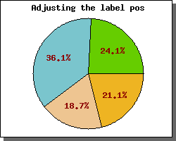
You can also adjust the position of the labels by means of the PiePlot::SetLabelPos() method. The argument to this method is either the fraction of the radius or the string 'auto'. In the latter case JpGraph automatically determines the best position and the the first case The following example illustrates this
If this formatting is not enough you can also "manually" specify the labels for each slice individually. You do this by using the PiePLot::SetLabels() method. This will let you specify individual text strings for each label. In each specification you can also add a printf() formatting specification for a number. The number passed on will be either the absolute value for the slice or the percentage value depending on what was specified in the call to SetLabelType()
The SetLabels() method can also take a second parameter, the label position parameter. This is just a shortcut to the SetLabelPos() as described above. By default the position will be set to 'auto' if not explicitely specified.
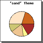
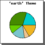
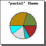
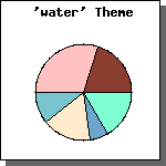
Another way is to use one of the pre-defined color "themes". This is just a predefined set of colors that will be used for the slices. You choose what "theme" you like to use with the method ( SetTheme() ) At the time of this writing the available themes are
Another simple change is to remove the border ( or change it's colors ) that separates each slice. This can be done by a call to ShowBorder()
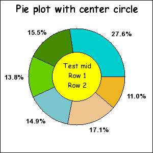
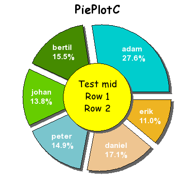
This variant is an extension of the standard PiePlot in the sense that it also have a filled circle in the center. The following example illustrates this
Since the PiePlotC is an extension to the basic pie plot all the normal formatting you can do for pie plots you can also do for the PiePlotC .
The additional formatting only concerns the filled middle circle. You have the option of adjusting size, fill color and all font properties. You perform these operations with the methods
| PiePlotC::SetMidColor() | Set fill color of mid circle |
| PiePlotC::SetMidSize() | Set size (fraction of radius) |
| PiePlotC::SetMidTitle() | Set title string (may be multi-lined) |
| PiePlotC::SetMid() | Set all parameters in a single method call |
The next example shows an example with some more innovative formatting. In this example we have :