Contents
Previous
Next
Spider plots are most often used to display how a number of results
compare to some set targets. They make good use of the human ability to
spot symmetry (or rather un-symmetry) . the figure below show an
example of a spider (sometimes called a web-plot). Spiderplots are not
suitable if you want very accurate readings from the graph since, by
it's nature, it can be difficult to read out very detailed values.
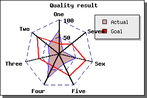 Figure 1: A typical radar graph with two plots
[src]
Figure 1: A typical radar graph with two plots
[src]
- There is one axis for each data point
- Each axis may have an arbitrary title which is automatically
positioned
- A spider plot may be filled or open
- You can control color, weight of lines as you are already used to
- A spider plot can, as usual, have a title and a legend
- The first axis is always oriented vertical and is the only axis with
labels
- Grids may be used (dashed in the figure above)
- You may have ticks (although suppressed in the figure above
- You can control the size and position within the frame of the graph
- You may have several plots within the same graph
In the following section we show how to draw both simple and complex
radar graph. As we will show all the settings will follow the same
pattern as for the more standard linear graphs.
Let's start by creating a very simple radar plot based on 5 data points
using mostly default values.
As the first thing you must remember to include the extension module
that contains the radar plot. "jpgraph_radar.php".
A very simple radar plot is created by the code
(File: radarex1.php)
 <?php

include (
"../jpgraph.php");

include ("../jpgraph_radar.php");


// Some data to plot

$data =
 array(55,80,
46,71,95
);


// Create the graph and the plot

$graph =
 new RadarGraph
(250,200,
"auto");

$plot =
 new RadarPlot
($data);


// Add the plot and display the graph

$graph->Add(
$plot);

$graph->Stroke();

?>
and
would give the result
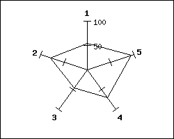 Figure 2: A first very simple radar plot using
default settings [src]
Figure 2: A first very simple radar plot using
default settings [src]
To change the size and position of the radar graph is similar to the
pie plot and you do it by using the methods
SetSize() and
SetCenter()
If you want a filled radar plot you need to specify the fill color
with the method
SetFillColor() The following example shows these methods in action
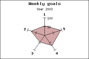 Figure 3: Changing size, position and adding fill
color to the radar plot. [src]
Figure 3: Changing size, position and adding fill
color to the radar plot. [src]
We normally would like something more meaningful as description of each
axis than it's number. Specifying the titles are accomplished through
the use of the method SetTitles() of the graph. Let's say that each
axis corresponds to a month. We could then use the code
 $titles = $gDateLocale->GetShortMonth();

$graph->SetTitles($titles);
As you can see the way radar plot is constructed will assign the
titles (and plot points) in a counter-clockwise direction. If you want
them in clock-wise order you will have to inverse your input data array
as well as the title array.
To specify a legend you (as with the other plot) make use of the
SetLegend(); method on each radar plot.
Each major tick mark can also be connected together to create a grid.
The grid is accessed through the 'grid' property of the graph. To
enable the grid and set the line style to "dotted" you would have to
add the lines
 $graph->grid->Show();

$graph->grid->SetLineStyle("dotted");
and would result in the following graph
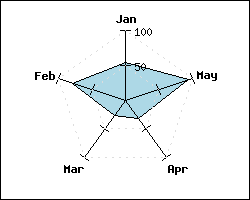 Figure 4: Adding dotted gridlines to the graph
[src]
Figure 4: Adding dotted gridlines to the graph
[src]
By design the plot is above the gridline but beneath the axis in
image depth, hence some part of the gridlines are hidden.
To have the gridlines more "visible" just change their color, say
to, dark red by invoking the SetColor() method on the gridlines which
would give the following result
Another simple change we could do would be to just change the
background color of the radargraph. This is (not surprisingly) done by
a call to the method SetColor() invoked on the graph object.
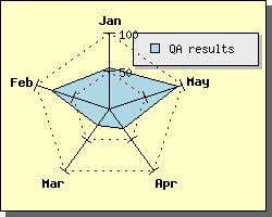 Figure 5: Changing the background color
[src]
Figure 5: Changing the background color
[src]
You can easily create several radar plot which are added to the same
radar graph. The thing to remember is that if you use filled radar
plots and they overlap each other that the order which they are added
will be the order they are drawn.
A simple example of this is shown below
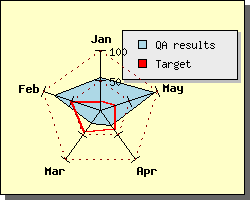 Figure 6: Several radar plots in one radar graph
[src]
Figure 6: Several radar plots in one radar graph
[src]
Contents
Previous
Next